Problem Statement
Design a user-centric mobile application interface for electric vehicle (EV) charging and parking, aiming to enhance the user experience in a sustainable and efficient manner. The challenge is to create an innovative solution that seamlessly integrates charging station location services, a smooth charging experience, and smart parking functionalities.
Device: Android
Research
Competitor Analysis
EV Charging and Parking application market is crowded. So, I conducted a competitive analysis of leading finance assistant applications like PlugShare, Tata Power EX Charge, Ather Grid. By examining their features and functionalities, I identified key strengths and weaknesses. The review section in the play store helped me understand a wide range of problems users faced.
User Journey Map
By using user journey map I visualized the experience a user has when interacting with the app. This helped me know their goals, feelings, Pain points and opportunities to help the user.
User Flows
By leveraging user flows, I created a detailed roadmap guiding users from onboarding to app mastery. I created multiple flows, conditions, alternative solutions for the conditions to solve their challenges.
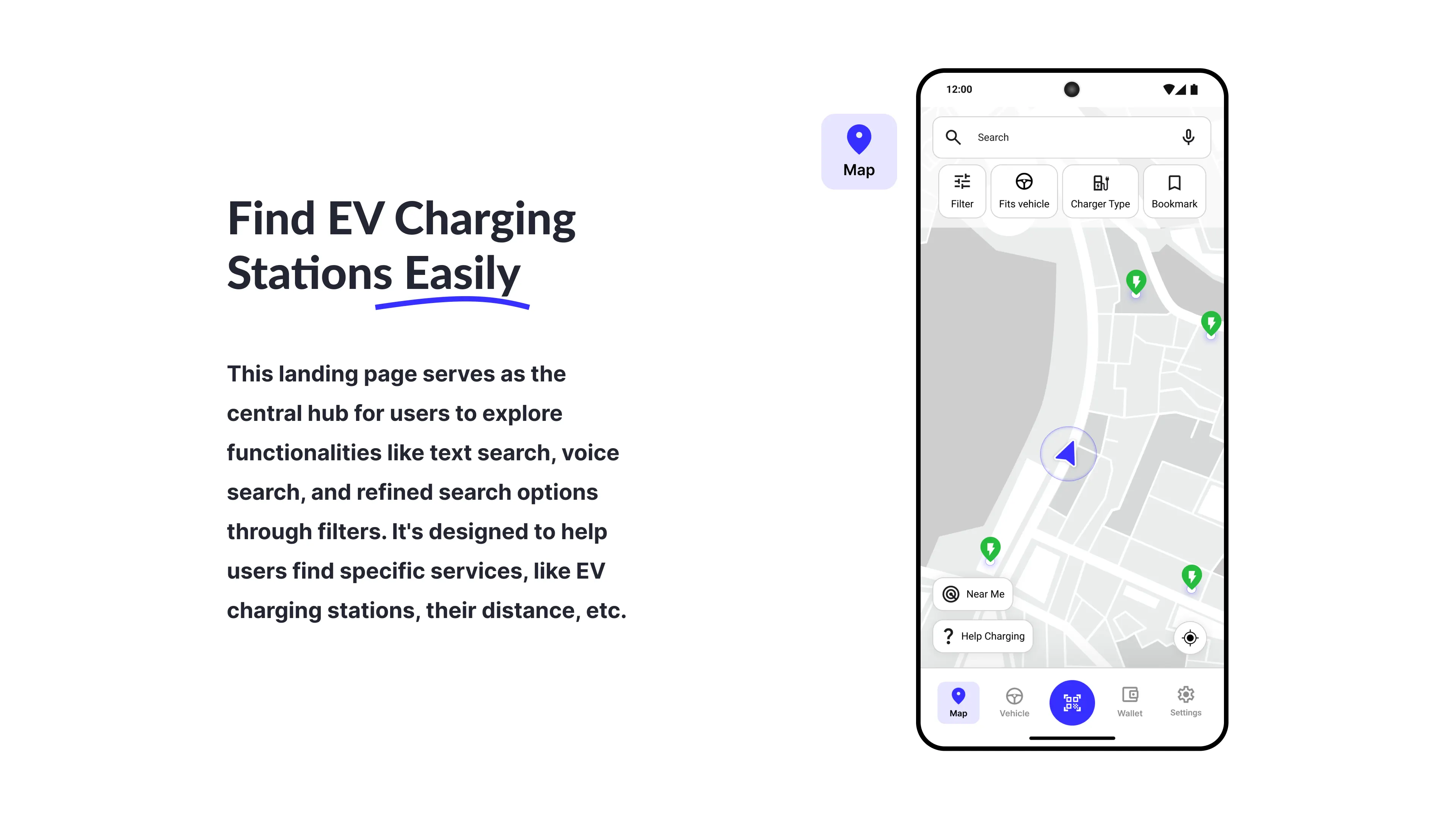
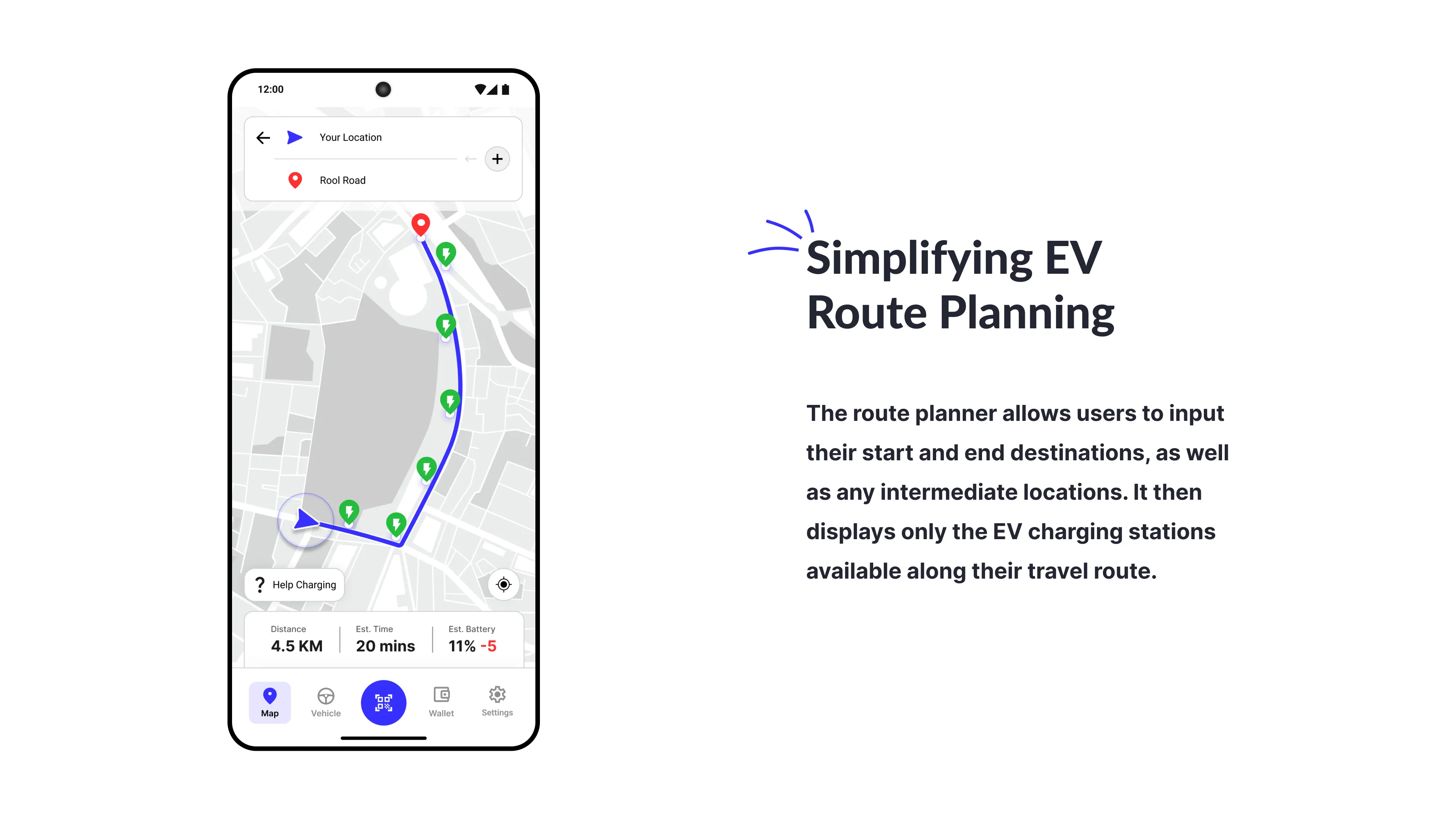
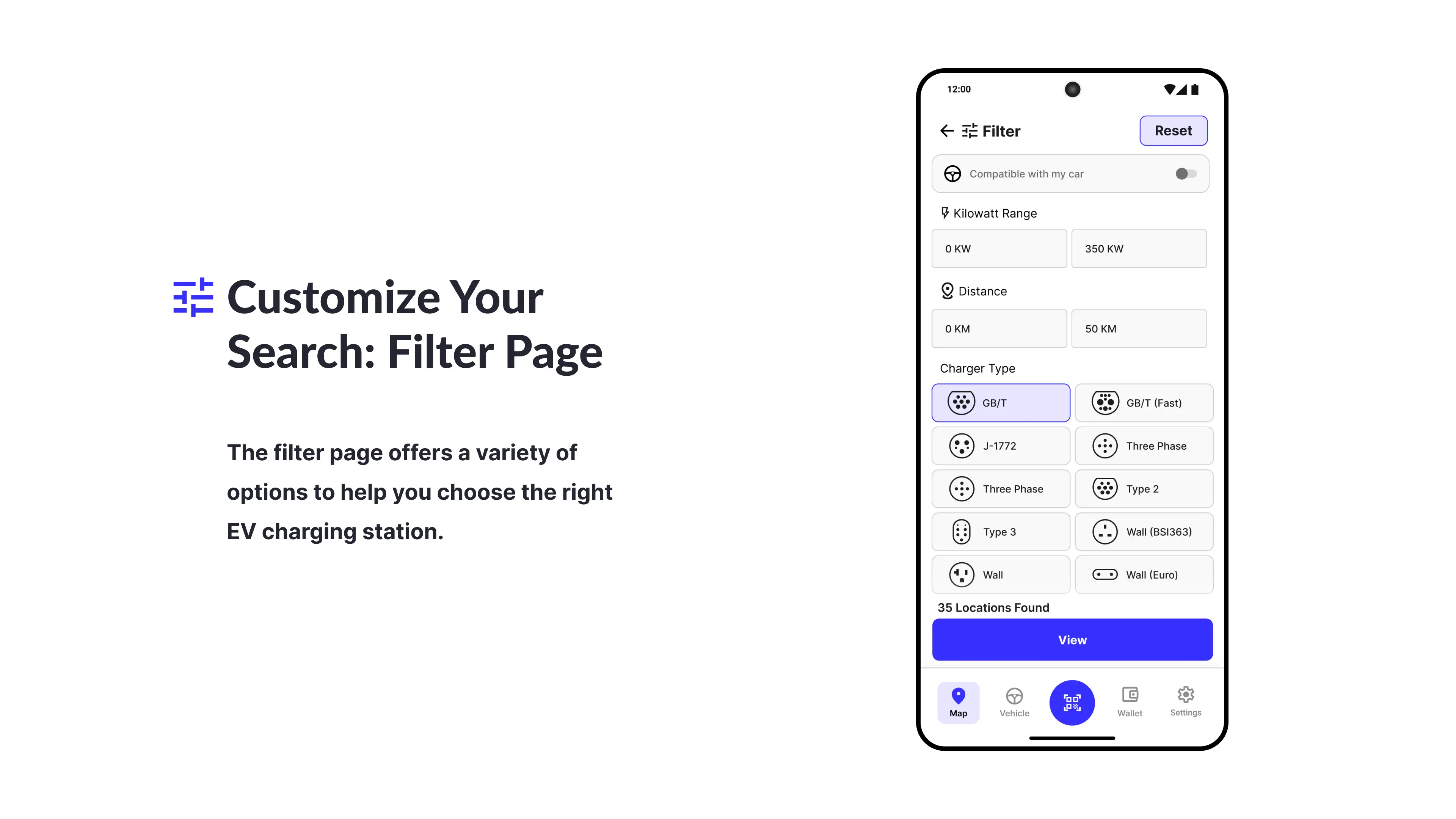
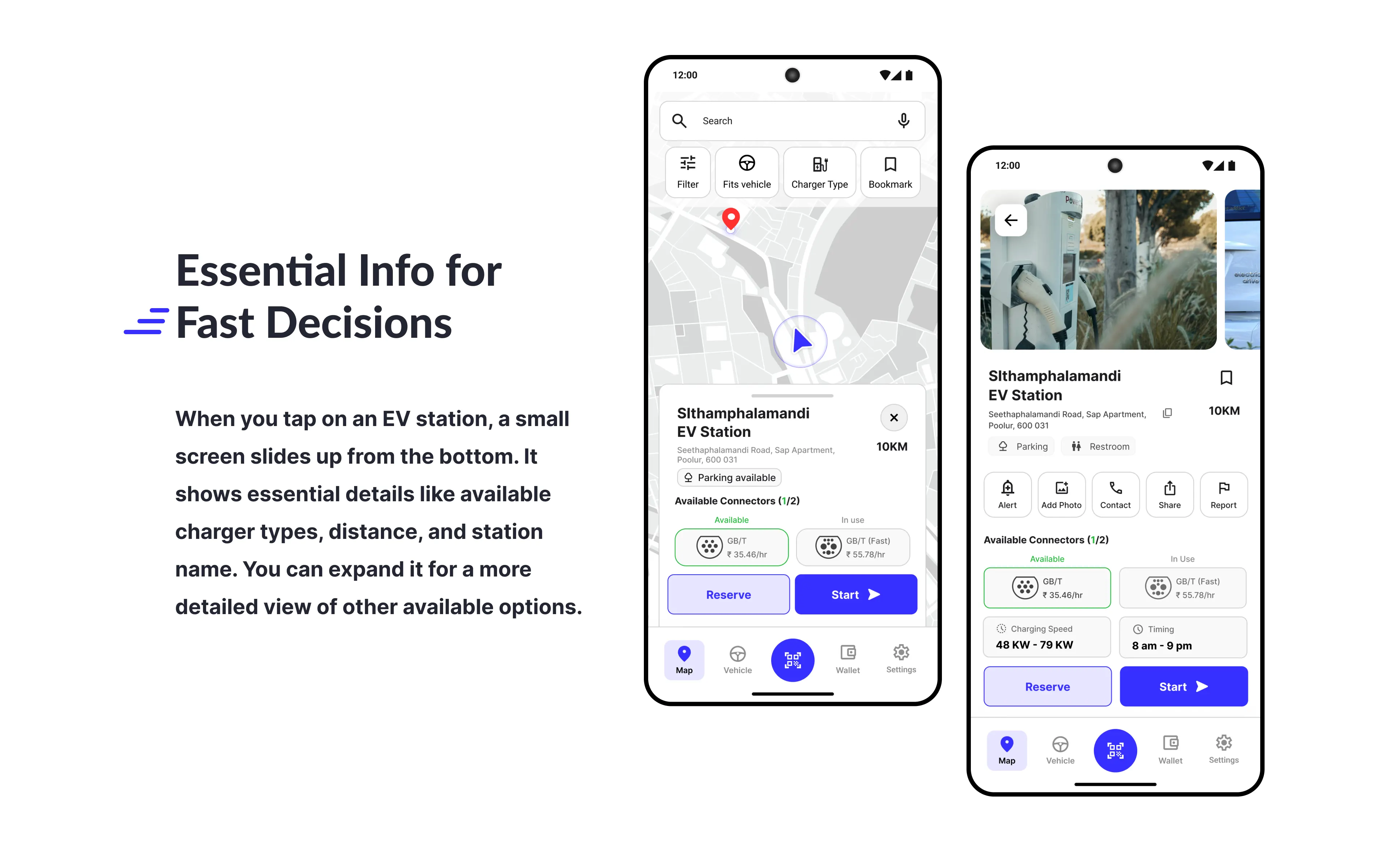
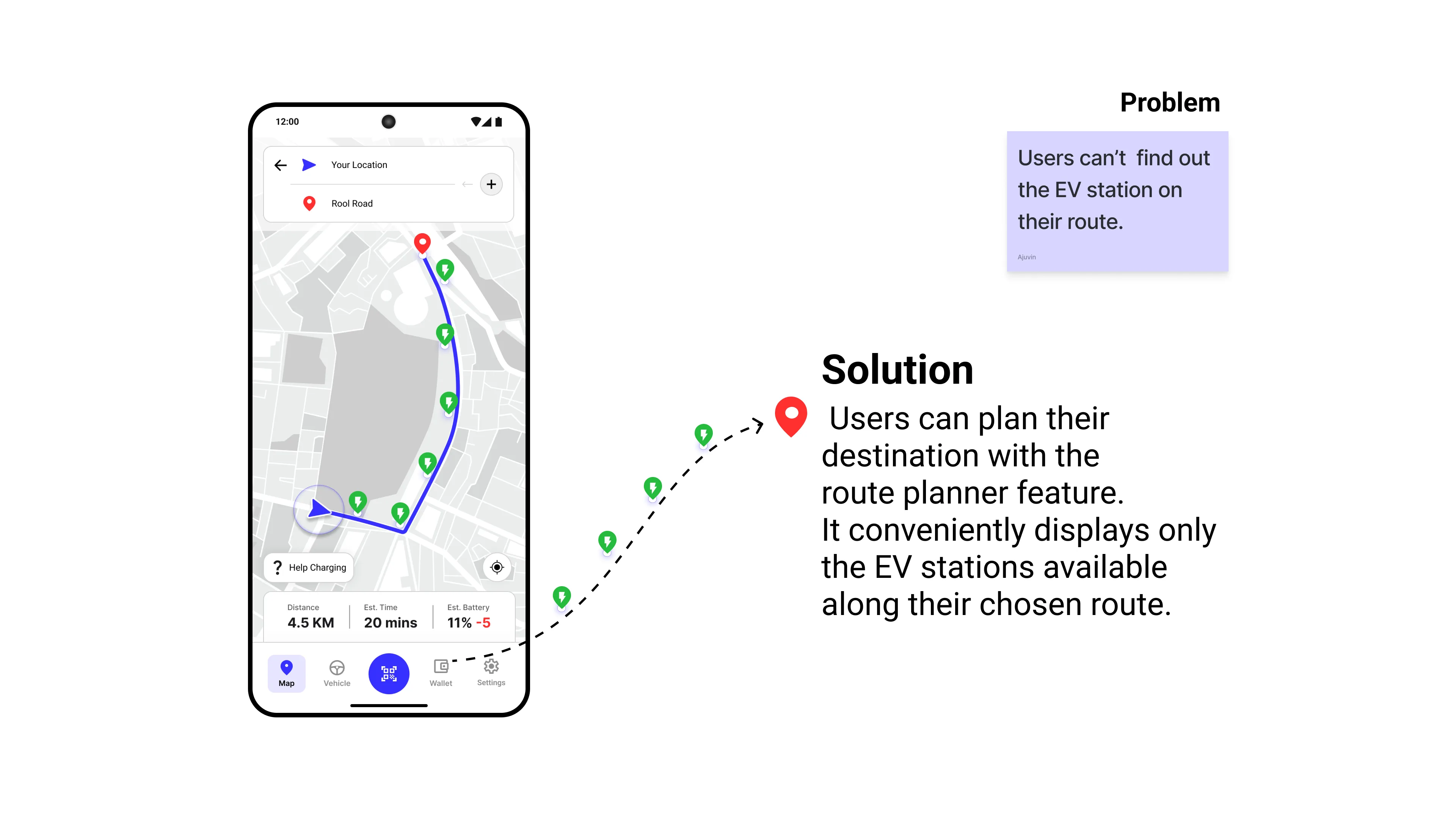
Route planner
Pay for EV Charging
Reserve a Charging Station
User Interface
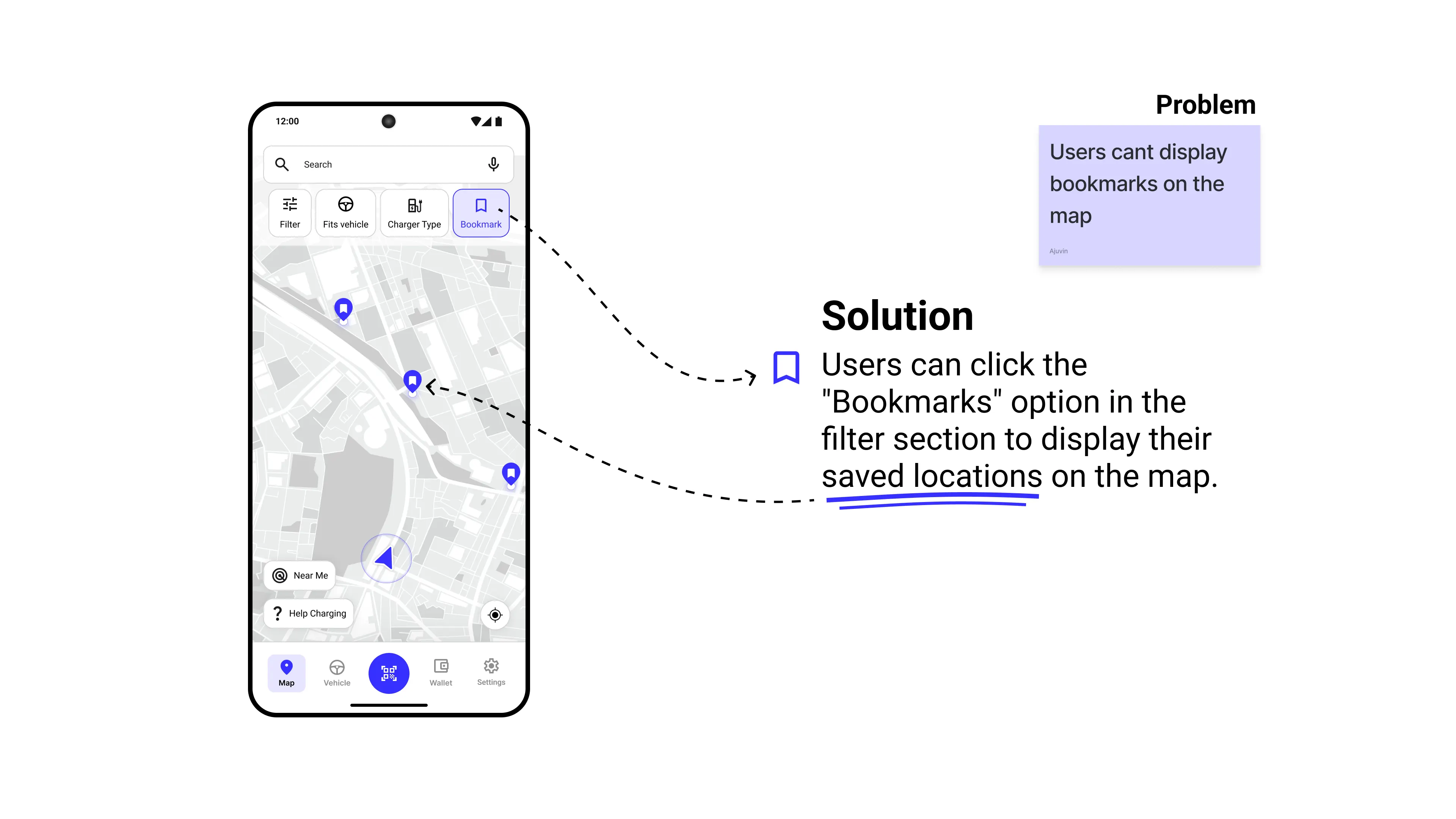
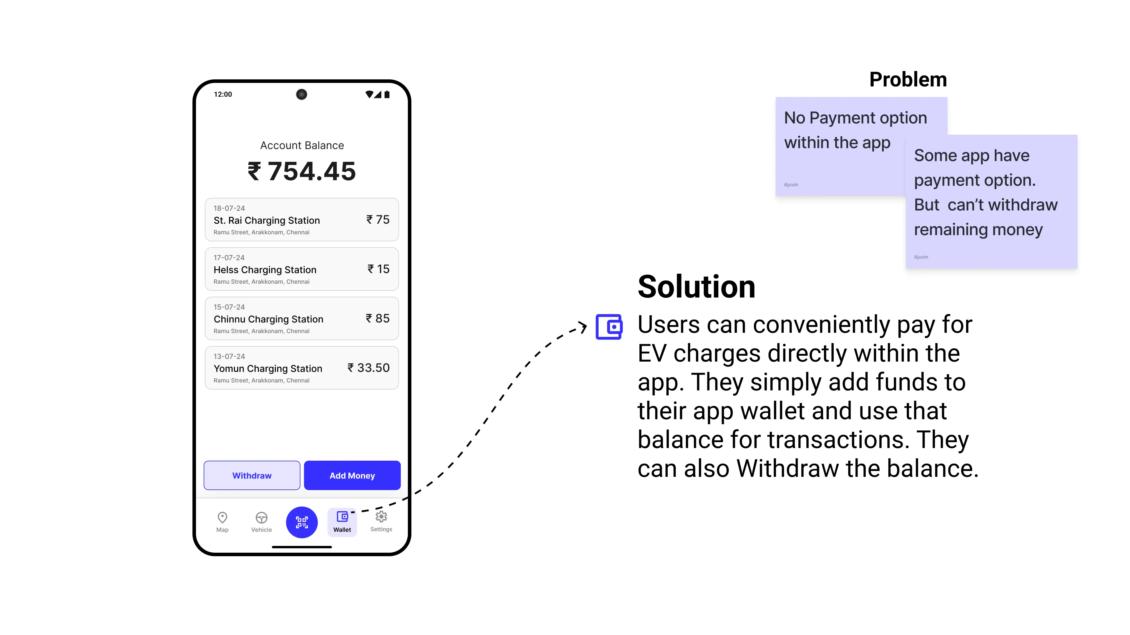
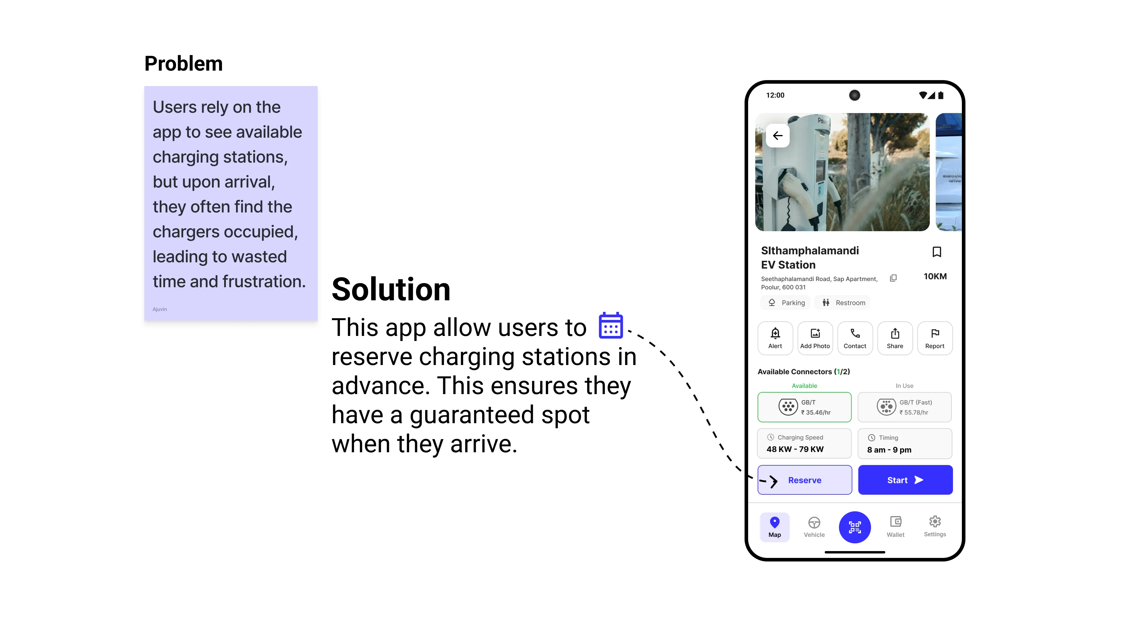
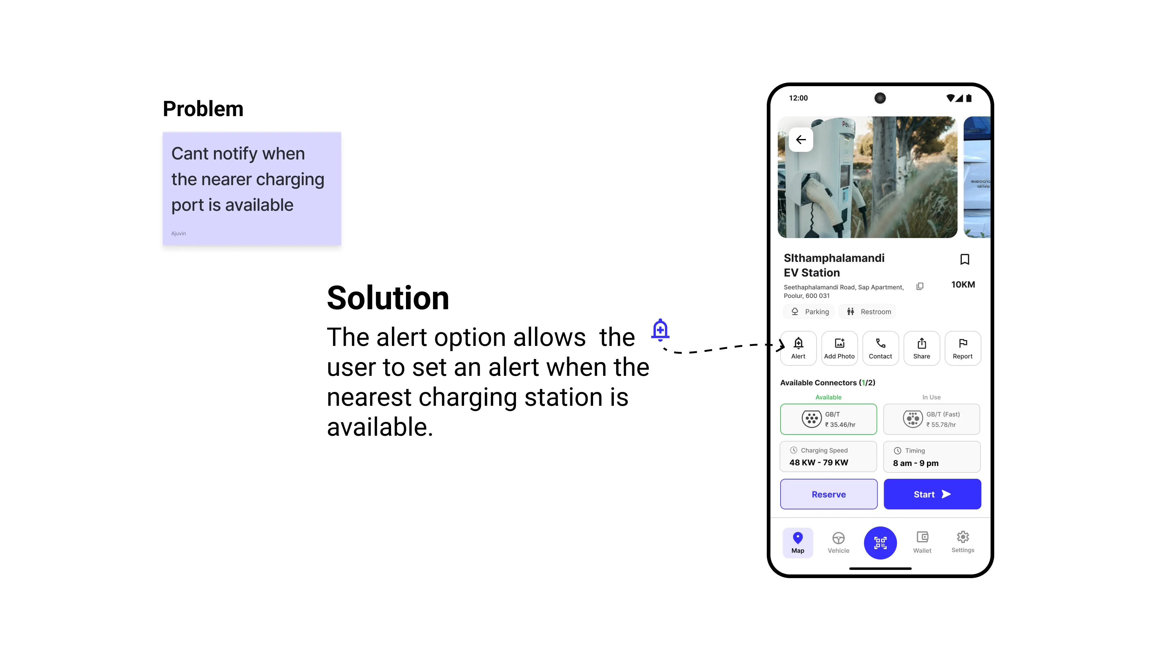
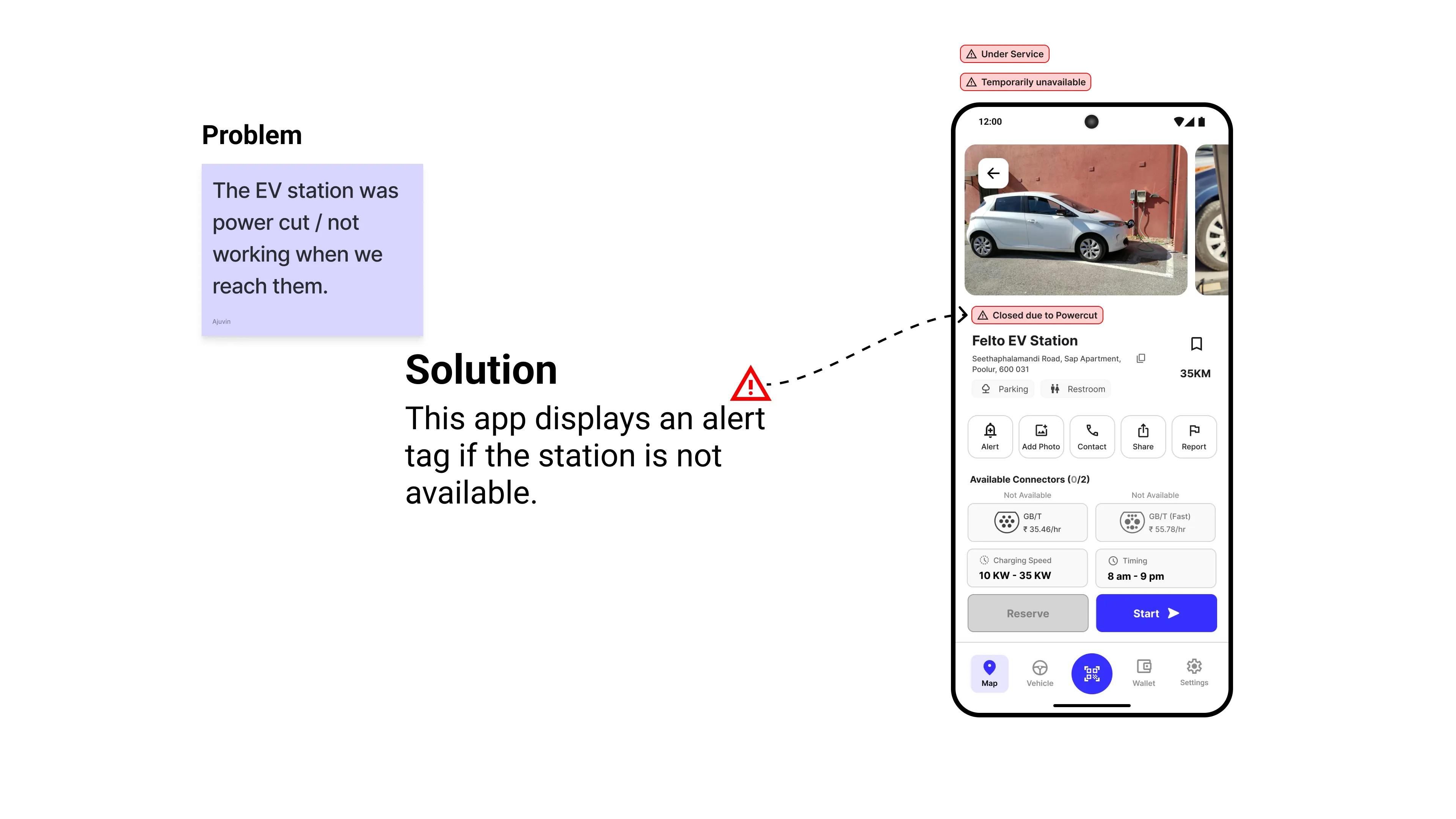
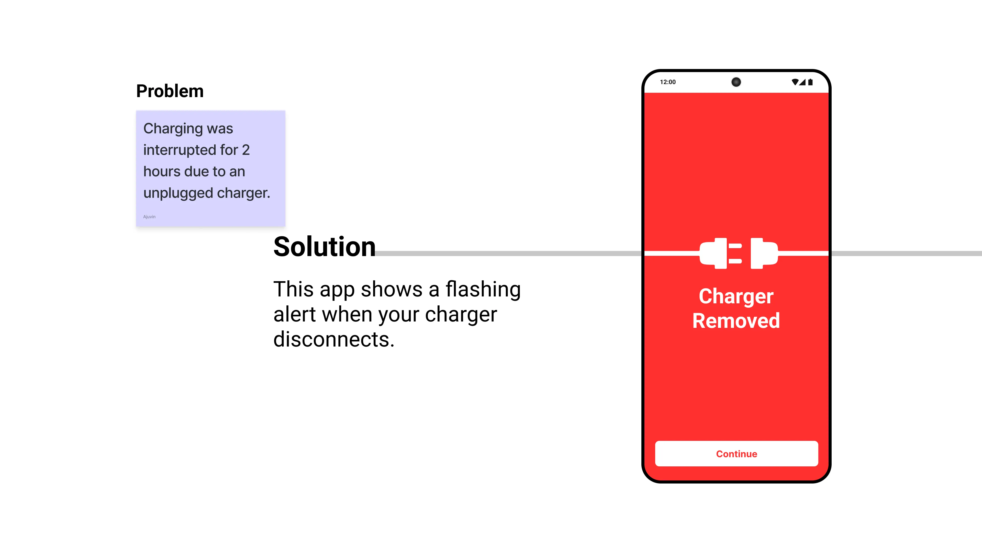
Problem and Solutions

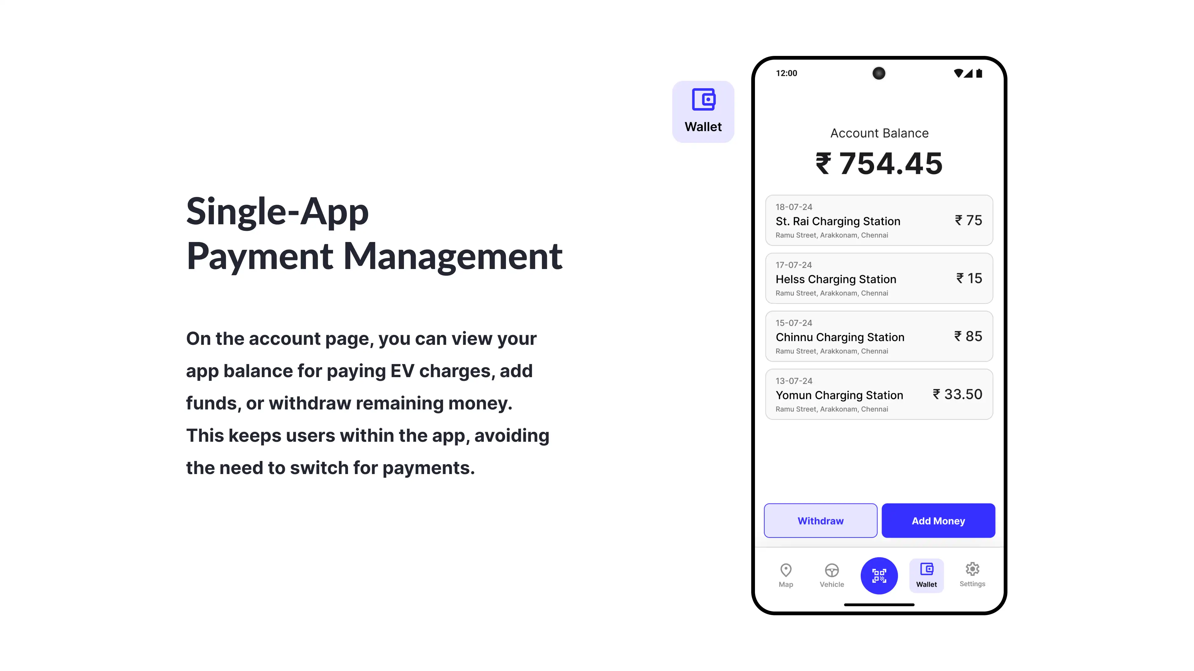

Design Solutions
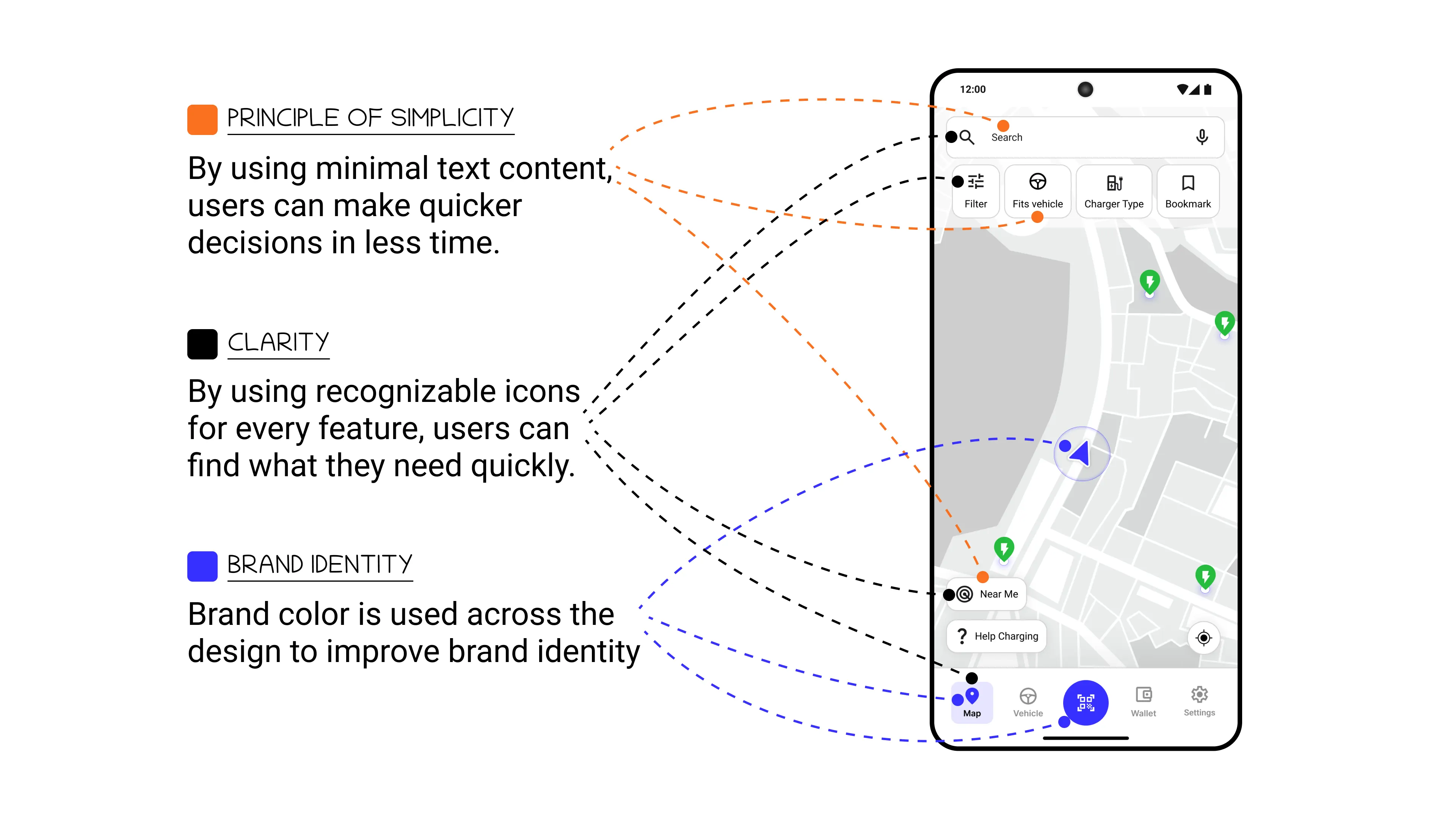
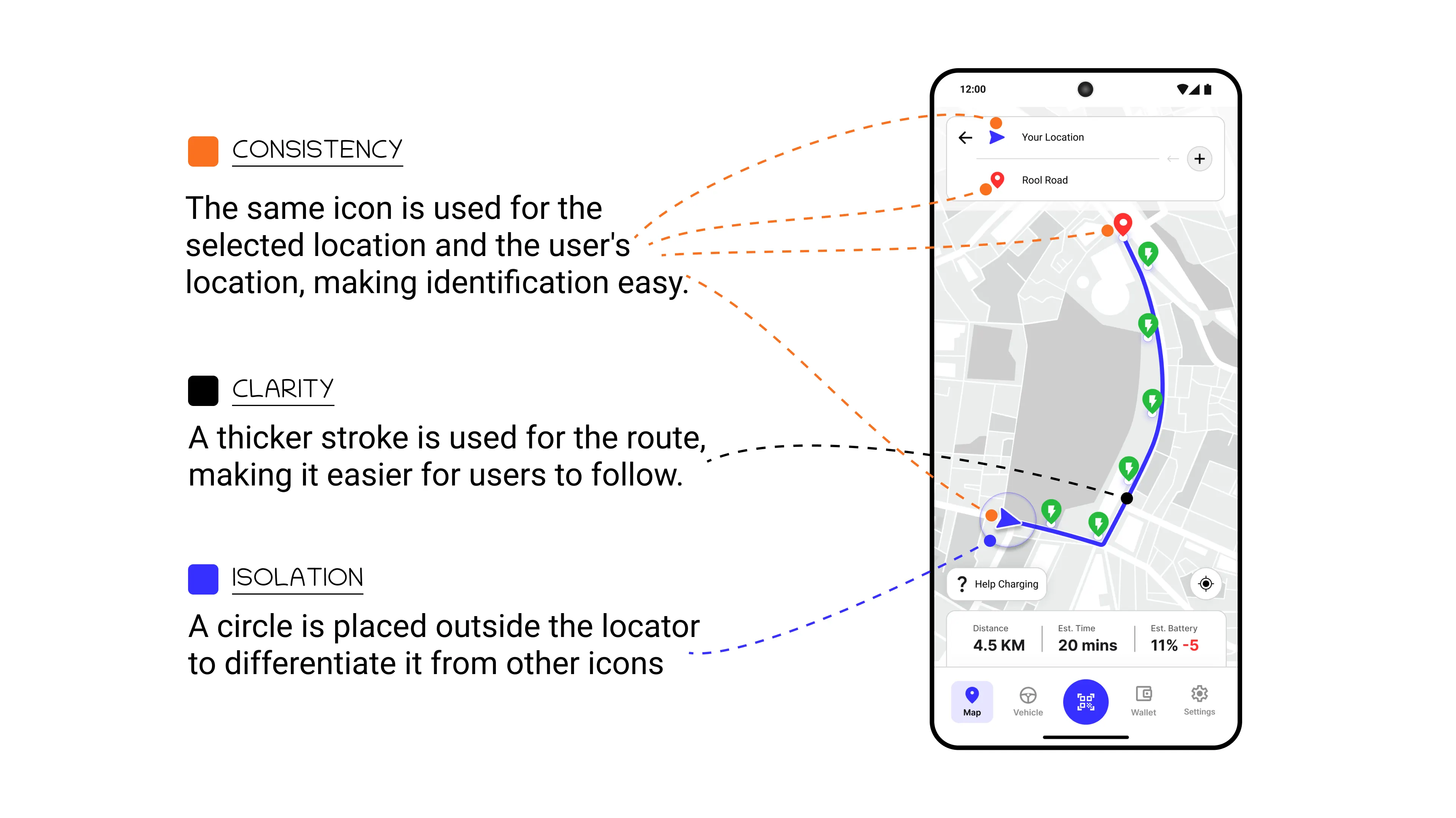
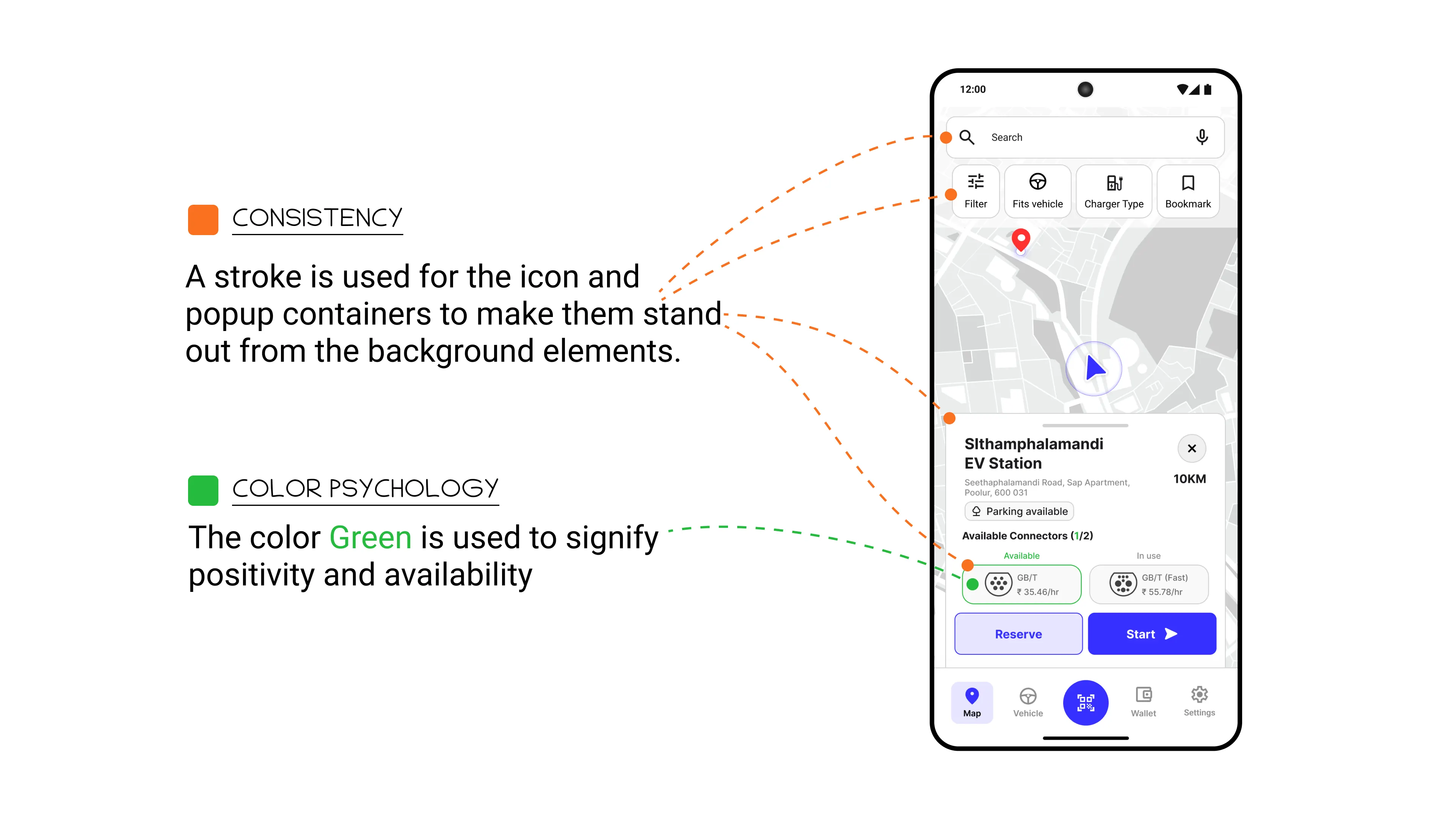
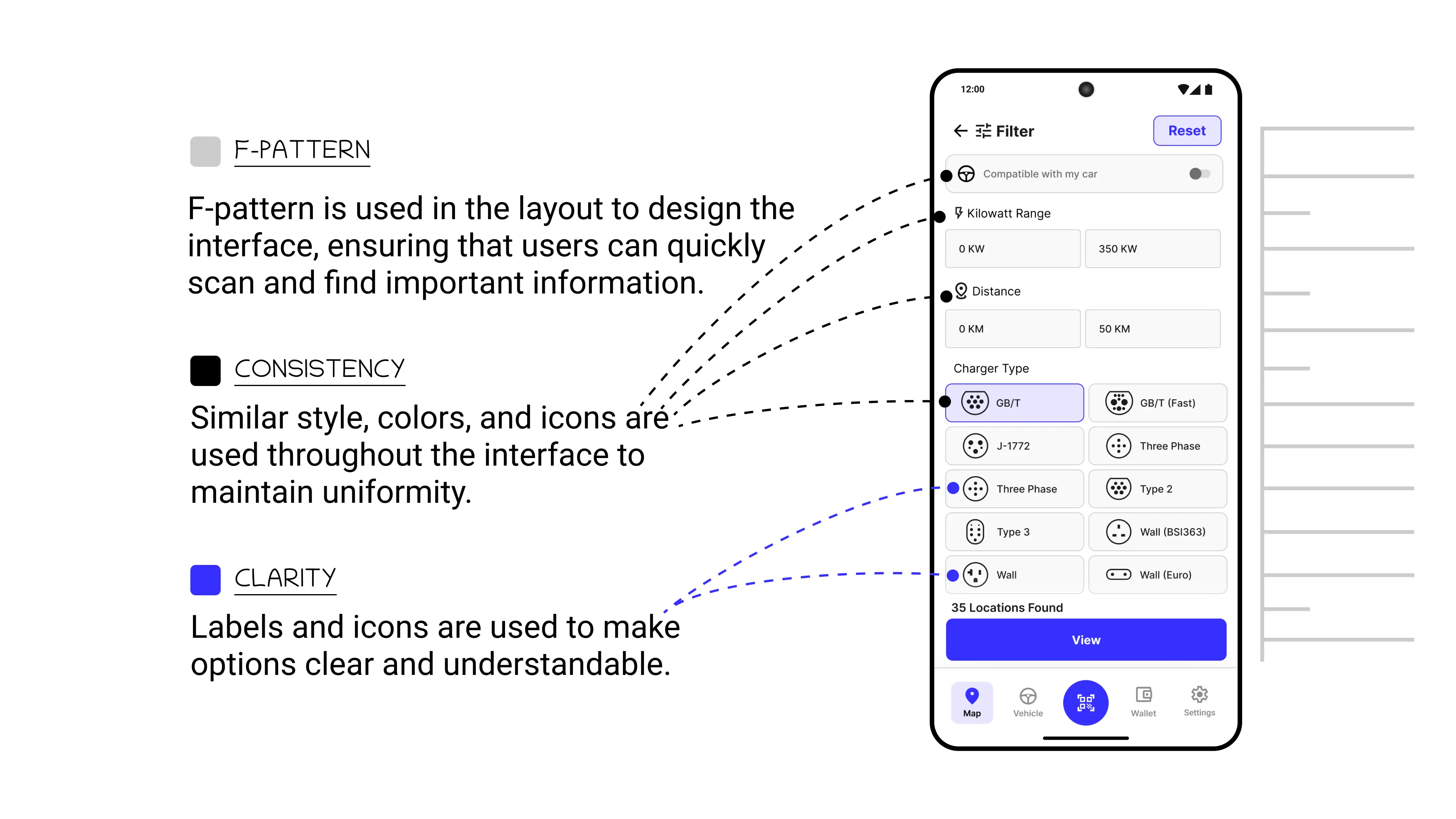
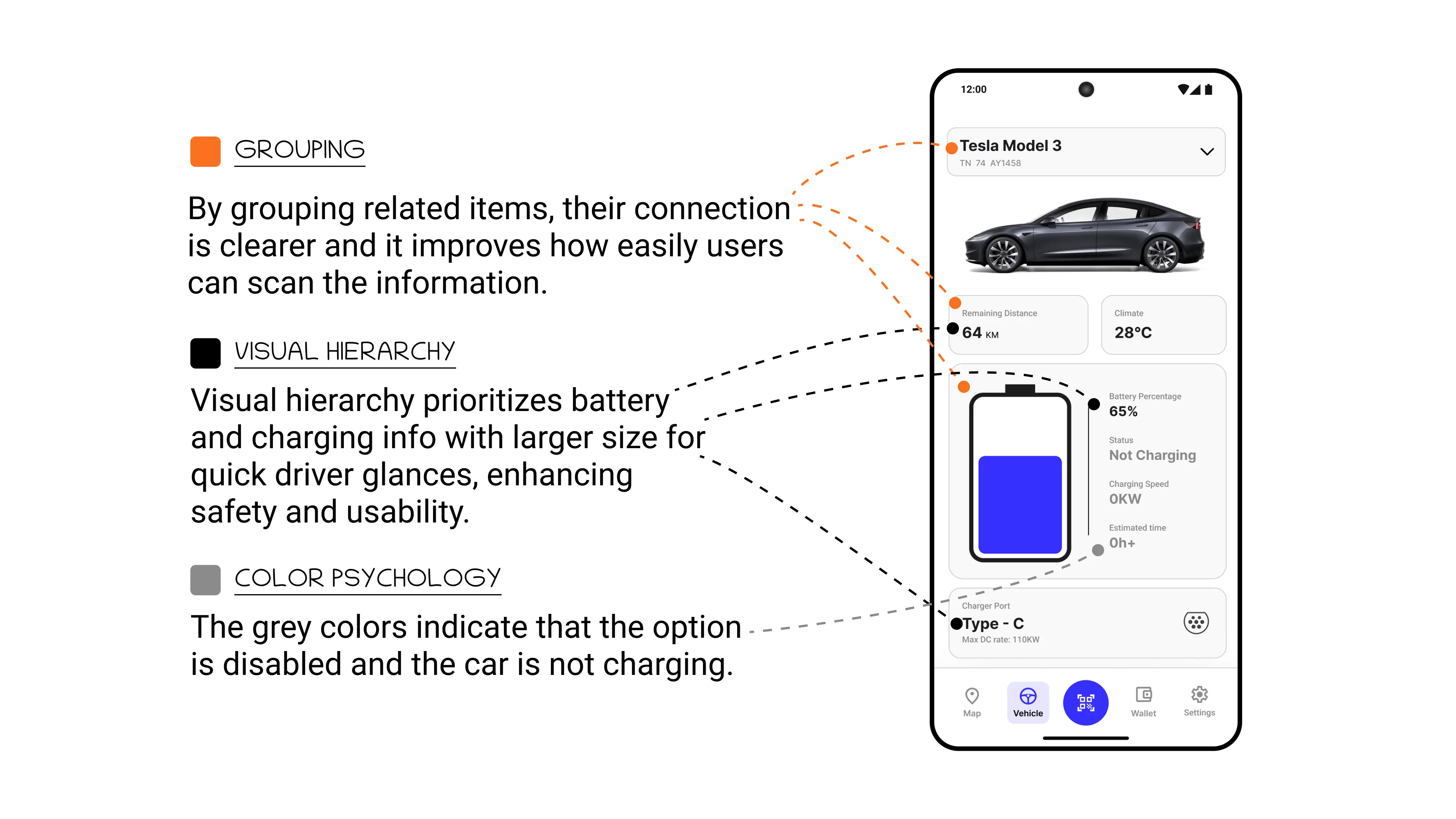
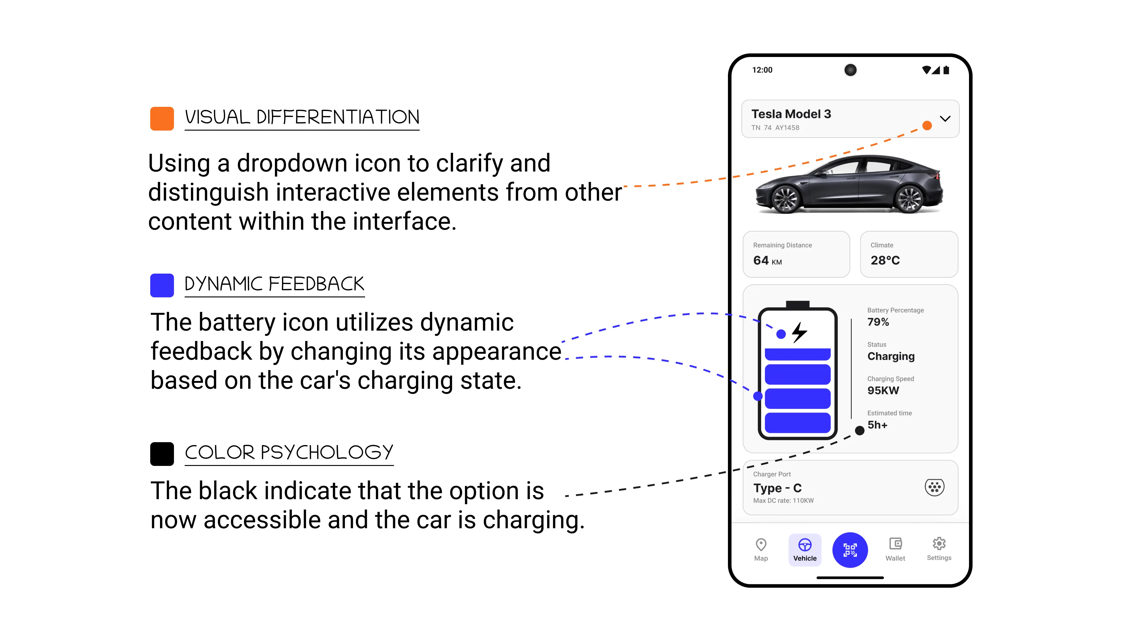
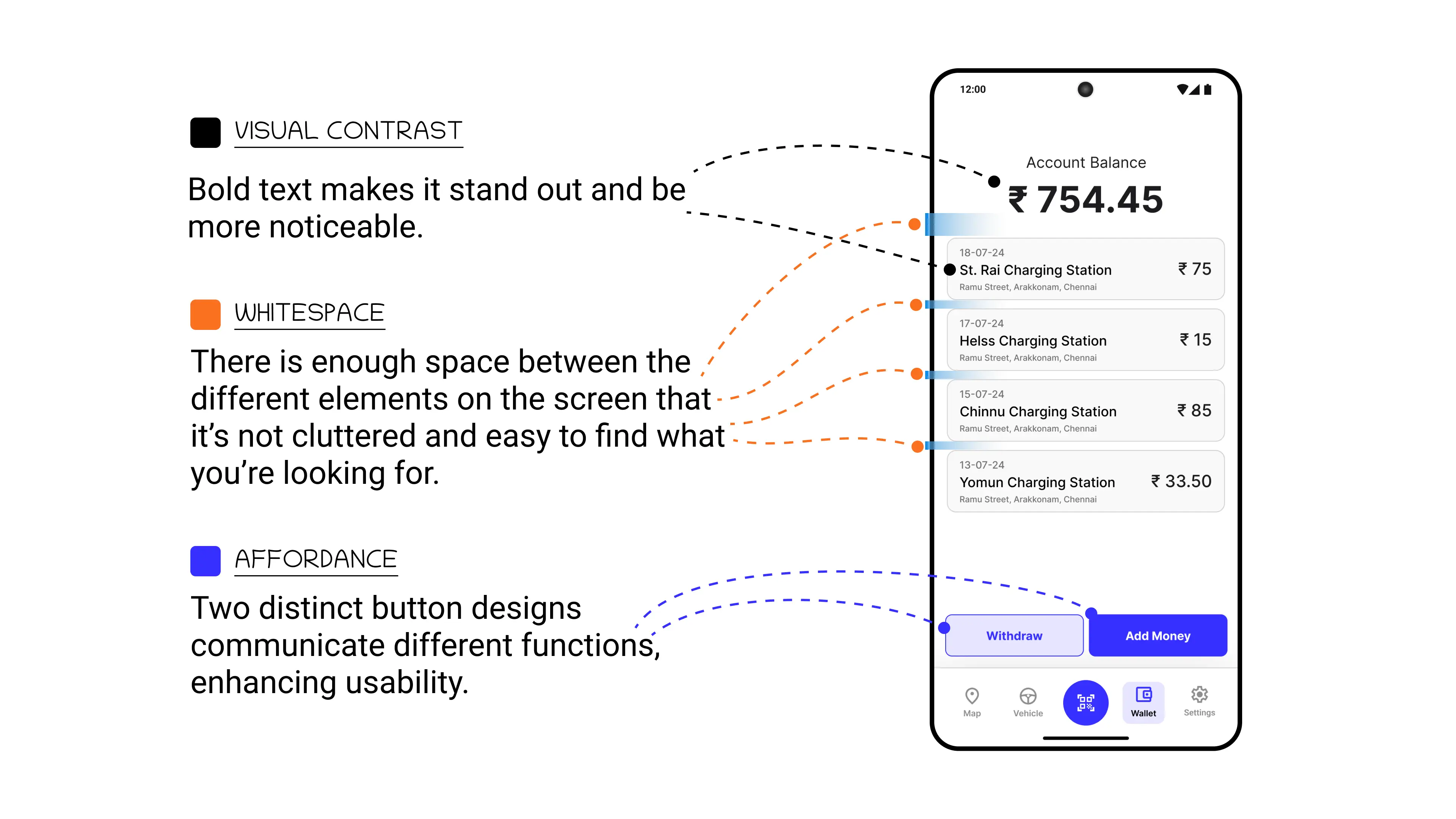
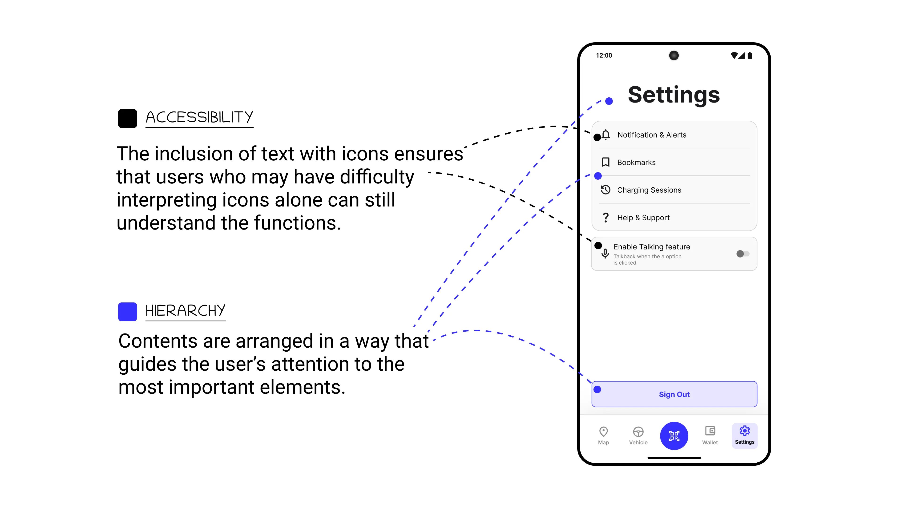
Design Decisions