VIT College Website Redesign (Concept) UI/UX Case Study

This UI/UX case study showcases the conceptual redesign of the VIT College website by Show Starters. The project focuses on improving mobile responsiveness, visual hierarchy, readability, and brand consistency through a structured design system.

Comparison thumbnail titled VIT College Website Redesign, showing a side-by-side transition from the old cluttered layout to the new streamlined design.

Project creation year: 2024

Problem Statement

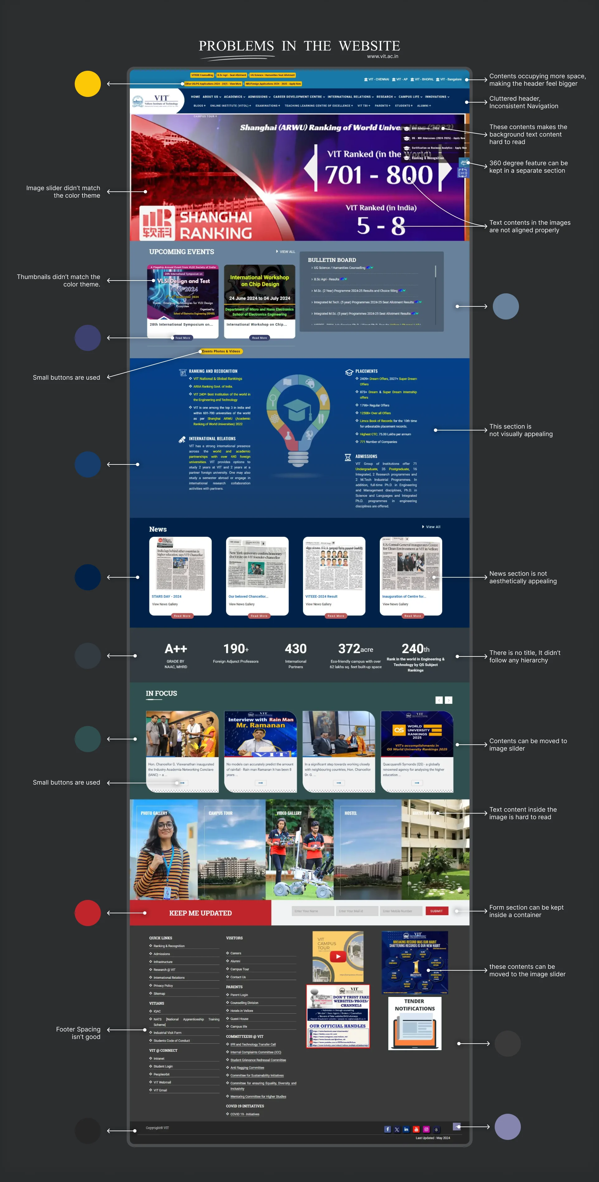
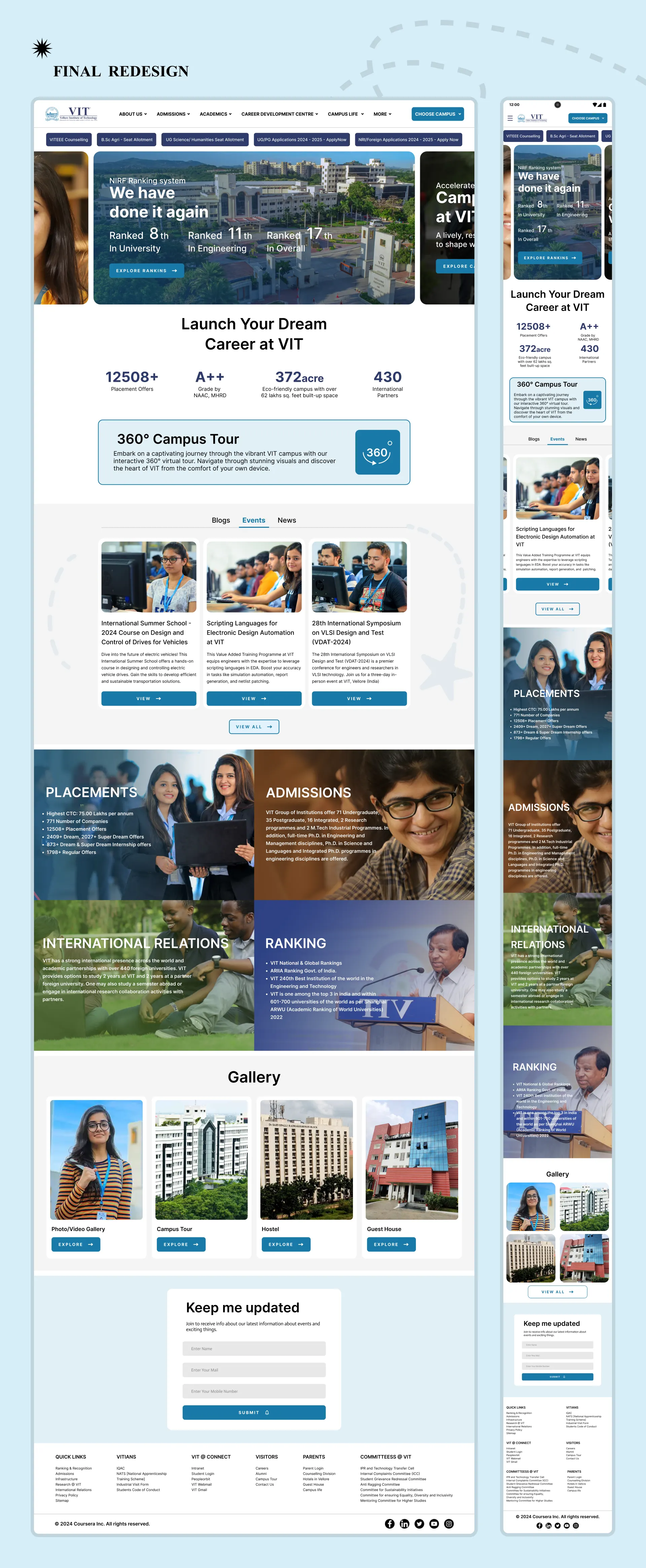
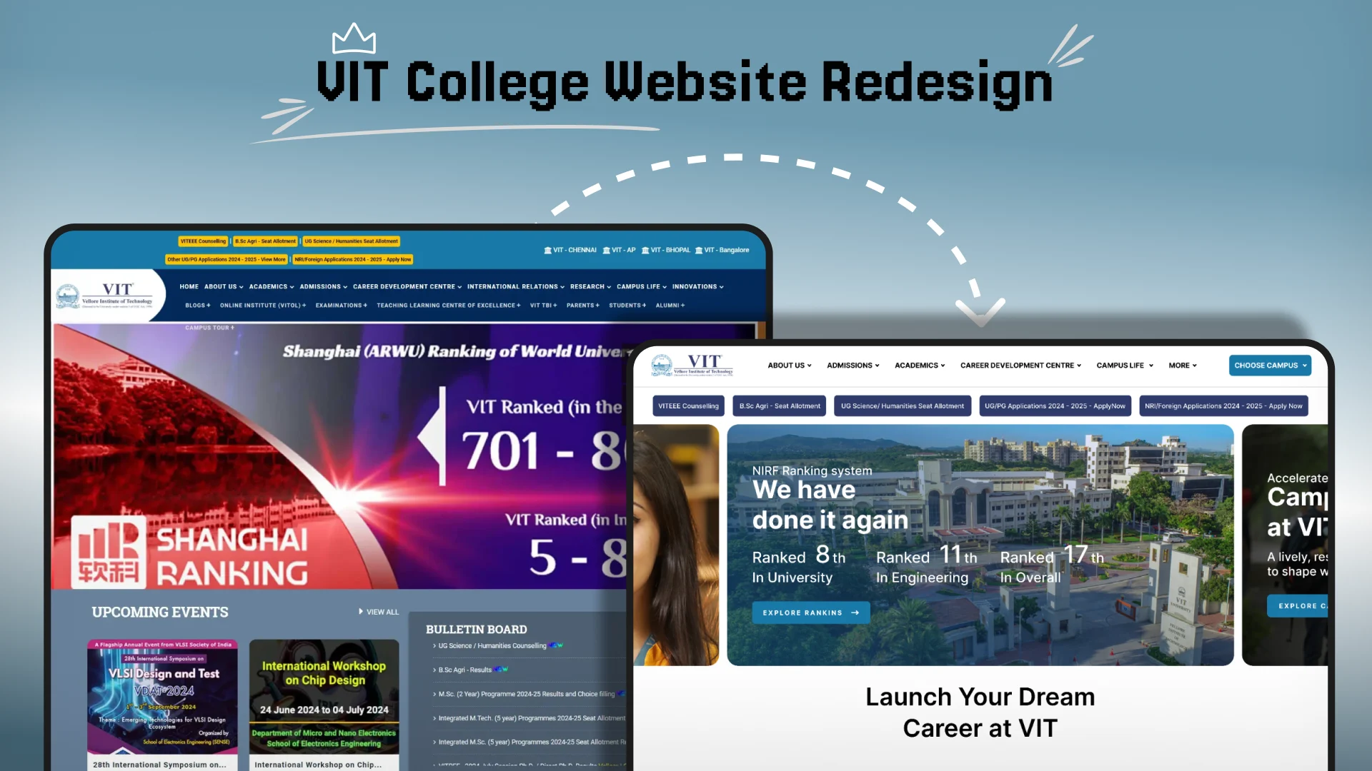
The website does not appear to be responsive to mobile devices, so its difficult to navigate using a smartphone. There is no clear hierarchy. The text is crammed together, so its hard to read. The website utilizes a broad range of colors across its design could result in a diluted brand identity.

Solution

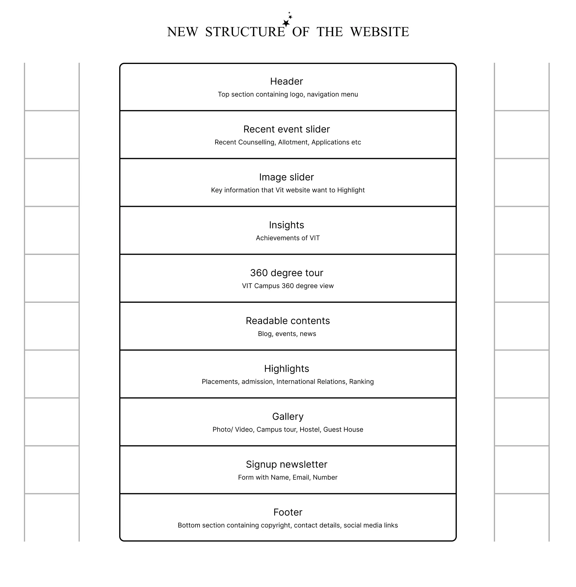
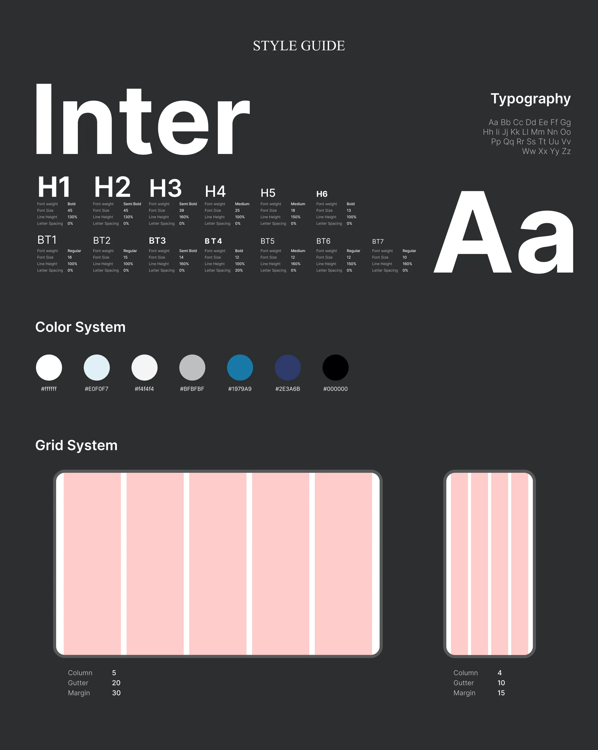
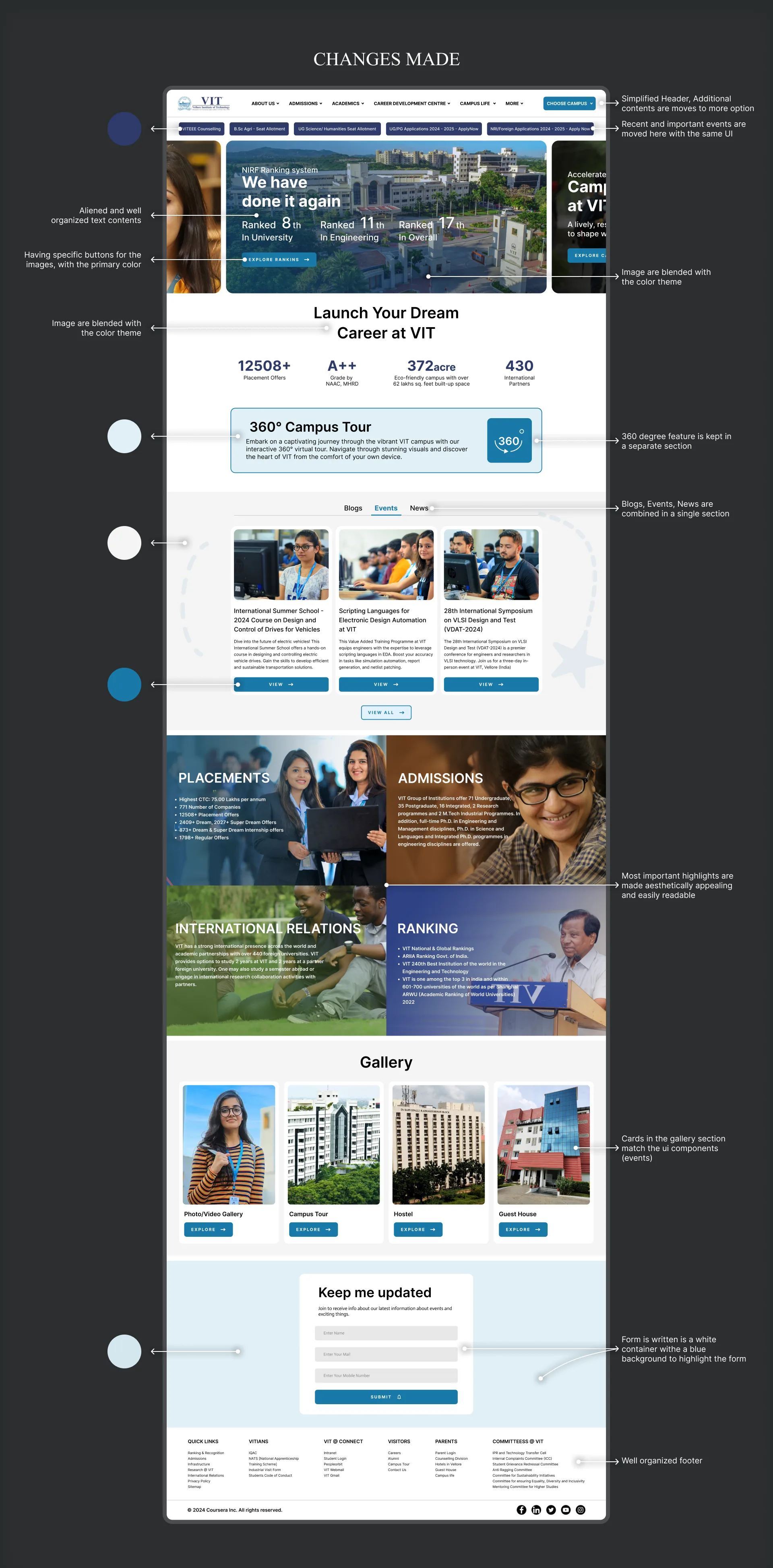
The used of 8-point grid system helps in creating a responsive website for both mobile and desktop. Creating a clear hierarchy helps the user to navigate and find the information they want. Adding a single typeface with good font size, weight, line height, letter spacing will improve legibility. Analyzing the brand and selecting its most prominent colors strengthens VIT's visual identity.

Visual audit of the original VIT website with annotations highlighting issues like cluttered navigation, inconsistent alignment, and poor color contrast. Wireframe diagram showing the new structural hierarchy of the website, including sections for header, event sliders, insights, and 360-degree tour. VIT website redesign style guide featuring Inter typeface, color palette with blues and neutrals, and 5-column grid system layout details. Detailed breakdown of redesign improvements, highlighting the simplified header, blended image themes, and organized footer layout. High-fidelity mockups of the final VIT website redesign for both desktop and mobile views, showcasing a clean, modern UI with high-quality imagery.